 The visuals and the look of any superhero or comic book film immediately sets the tone for what is to come. This new image of Chris Evans as Captain America reinforces that a very important aspect of that is always the outfit that said superhero wears. The tights-and-spandex getup has long been an object of ridicule - what may look flashy and dramatic on the printed comic book page may just look silly on the big screen, if done wrong. Costume designers of such films have the interesting challenge of striking a balance between preserving an iconic image and creating something which would work in real life - or at least in the comic book universe the film establishes.
THE BATSUIT
Where else do we begin but with my favourite comic book superhero? A large part of Batman's appeal is that he is ordinary human being - he didn't come from another planet, nor was he bitten by a radioactive spider. He's forged himself into the ultimate human weapon, and it is his suit that plays a big part. The Batsuit has to look dramatic, scary and larger-than-life - at the same time, it must also be functional and help, rather than hinder, its wearer.


 In Batman and Robin, the Batsuit was the first of many nails in the coffin for the garish, overblown and stylistically self-indulgent mess. Production designer Barbara Ling made even more departures from the Batsuits of the Tim Burton era. The default Batsuit featured more pronounced nipples than earlier, and also the spikes on the gauntlets becoming more like fins. For no reason apart from giving the opportunity to make more toys, Batman, Robin and Batgirl change into silvery suits for the film's last act. No further comment.
In 2005, Christopher Nolan resuscitated the Batman film franchise with Batman Begins, which was firmly grounded in reality. As part of Batman's origin story, the genesis of the Batsuit was also revealed: it was originnally body armour meant for special forces soldiers, but was deemed too expensive to be of any practical use. The cape could also stiffen into a glider wing when an electric current was passed through it, and the gauntlets were carried over from Bruce Wayne's training with a ninja clan. I really like the utility belt on this version, which was also carried over into its sequel The Dark Knight. The armour looks militaristic and practical, but the neck seems too thick.
 In The Dark Knight, Batman was able to turn his head for the first time on screen, with a new cowl that worked like a motorcycle helmet, detached from the neck portion. Instead of being in one solid piece like in every film prior, the armour on this Batsuit was split into individual plates, allowing for more mobility. However, this aesthetic also makes the suit look a little "busy", and the Bat symbol on the chest is far less distinct. In the end though, this is the Batsuit which makes the most practical sense, and the texturing on the suit is such that some of the mesh armour is still visible.
 SUPERMAN'S COSTUMES
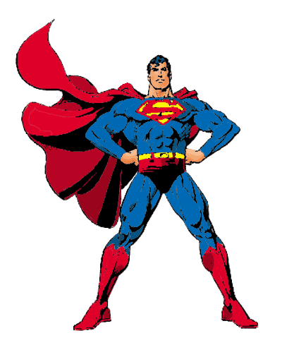 Superman's outfit is one of the most iconic and recognisable ever. Blue and red tights, big "S" symbol on the chest, red briefs on the outside. Realising this look on screen however is much harder than it looks. The image below shows the evolution of Superman's costume on the big screen, from Kirk Alyn and George Reeves' portrayals in the 40s and 50s, to Brandon Routh's version in Superman Returns.
 The defining features of Superman's look have not changed much, but it is interesting to see how aspects such as the colours and the size of the "S" symbol have changed. Christopher Reeves will forever remain the definitive screen Superman. Up till that film, moviegoers had not seen a superhero tale presented in such epic, grand fashion on the big screen. The colours are bold and saturated - this is a nigh invulnerable figure with nothing to fear and nothing to hide.
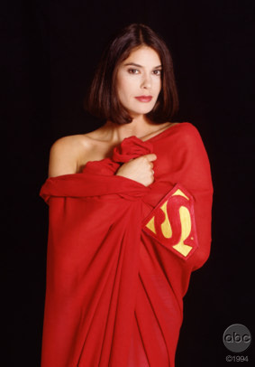
Lois and Clark: The New Adventures of Superman presented Dean Cain as a Superman for the 90s. The main alteration in his look would have to be the removal of the iconic spit curl, which may have seemed outdated and silly to the audiences of the television show. Also, Superman's neckline is lower, and supposedly more sexy for it. But who are we kidding, "Lois and Clark" was all about Teri Hatcher's Lois.
 Superman Returns had the challenge of making a product of the 30s seem relevant for audiences in 2006, and the costume was definitely very important in selling that idea. I really like the decision to mute the colours, making the red of his cape, briefs and boots a rich maroon. The "S" symbol was also made smaller and was raised, as was the buckle on his belt. Another interesting facet of the Superman Returns suit was that the entire fabric was texutred, and the "S" symbol embossed with much tinier "S" symbols.
ALONG CAME A SPIDER-MAN

 Spider-Man is another superhero who favours blue and red. This is one costume that can easily look cheap, tacky and downright horrible - as was the case with the (thankfully) little-known films of the 70s starring Nicholas Hammond.
It's a good thing then that the movies we are familiar with, those directed by Sam Raimi and starring Tobey Maguire as the webslinger, feature pretty good incarnations of Spider-Man's outfit, as realised by costume designer James Acheson. The spider logos on the front and the back of the suit are sleek and stylish, the fish scale-like mesh of the bodysuit sophisticated, and the raised webbing pattern and mirror-like lenses for the eyes topping everything off nicely.


THE X FACTOR


deff true
ReplyDelete-Lucid Dream Guide